Changelog (web) — New app design
Our web app just received a big upgrade, matching the fresh new look we brought to the mobile app with the release last month. Here’s what’s new:
General
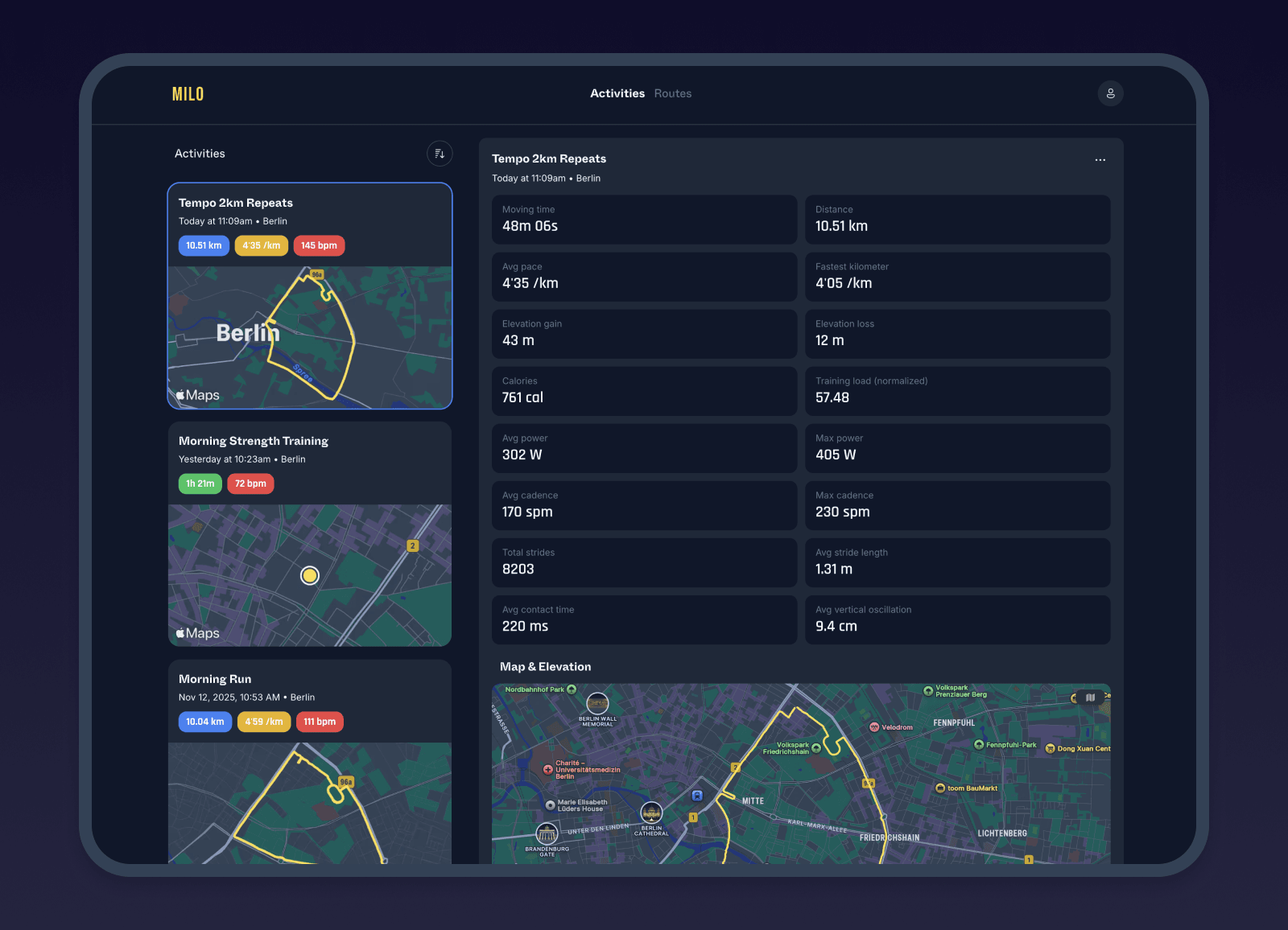
The entire app has been refreshed for a cleaner, more consistent look aligned with the iOS app.
Navigation now lives at the top, giving you more room to explore your stats and maps.
Every route and activity now includes a preview image.
The Settings page is now its own section, accessible from your profile menu in the top right. It’s organized into categories like Preferences (light/dark mode), Biometrics (max heart rate), Heart rate zones, and Milo paces.
You can now sign in using Apple in addition to Google.
Activities
You can now view the laps you recorded on your watch, both automatic and manual.
Splits are now visible on the web app.
You can analyze your heart rate across your entire activity.
For runs and rides, heart rate is shown over distance.
For non-distance activities (like strength training), it’s shown over time.
The heart rate and elevation graphs now feature an improved tooltip for smoother analysis.
Each activity now includes advanced stats, such as ground contact time and weather data.
You can now rename activities directly.
Marketing pages
News — Check out milo.app/news for company updates, product changes, and running insights.
Learn Hub — Explore milo.app/learn, your go-to guide for getting the most out of Milo. Browse by category or search directly — and you can access it right from the app whenever you need help.
Changelog — We’ve moved our changelog to milo.app/changelog, where you can follow all updates for the watch, iOS, and web versions. Many of your suggestions are already in there.
This was a major overhaul of our web experience. If you spot any issues or have new feature ideas, we’d love to hear from you.